COEXISTENCE
The color trend report is utilizing the format of MIX Magazine ©
This report is to forecast color trend for A/W 2020 and 2021: Coexistence starts ‘Mere-Exposure Effect,’ which refers to the phenomenon of having a positive attitude toward frequently exposed stimuli or targets. In other words, this effect means that a positive attitude can be developed towards even strange or indifferent things when they are encountered frequently. The main story of the trend report is harmony between the new and familiar ones, and it expects to create advanced and unexpected incidences.
Overview

‘Coincidence’, hovers halfway between the new and familiar ones, creating the advanced and unexpected, illustrating with our expectations.
'Coexistence’ creates new things from familiar ones. New emotional and retro-style encounters expect to continue in F/W 2022. Heritage mood will create the nostalgia of the older generation and can reach out to the new. It focuses on the eternal trendy emotional spirit that coexists the elegant era of the Rococo era in modern simplicity. Today is the ‘Slime’ generation that changes flexibly depending on the situation. It becomes an age of natural harmony with all: between old and new, artificial and natural, and man and woman.
In F/W 2022, recycling materials and eco-friendly materials will become essential, reflecting the environment and health-consciousness. It comes from our desire to cherish and protect what we have. Green initiatives focus on reducing total waste production, controlling consumption, and saving resources. The sustainable design emphasizes the periodic structure where waste becomes an entirely new resource. The safe and continuous circulation of precious natural materials is a human effort to protect nature. And, it starts with a heart that values humans and nature.
Color scheme


Color Analysis
The mood of the Coincidence palette reveals a fascinating interaction between new and familiar one of colors with a color story. We learn relationships, proportions, and applications.
A. Today is a product of the past. The future reflects the present. A mix of faded mint and tone downed greens reflects the nostalgic freshness.
B. The ambiguity of one’s ego. This bold and fiery orange can’t harmony. But, between the blazing orange, the cold mint glows with a mysterious glow.
C. Glorious colors of the sunset are reflected in the face. Feel the warm light beige and fall into the shadow of dark and calm colors.
D. The deep, saturated southern light perfectly shows the dramatic sky around the shining moon s the morning sun shines through the desolate blue dawn.


Each color individually entertains the eyes, but they have a much more delicate hue in together. The bright, still tone creates a playful, fun, and modern atmosphere (01). Crilly Orange is complemented by Vanilla Beige. Occupying the opposite color of Ash Indigo positions sharing similar levels of saturation creates a dynamic partnership with bright mint green. The exciting dynamic and color mood will be clearly addressed in sportswear, electronic tools, and textiles (02). The subtle coloration. The almost pure whitish-gray of an Ice age and nearly navy blue create a nuanced grayscale in combination with Quince green (03). With similar hue and saturation, Cockscomb violet, Turquoise green, and Oak brown create a classic frame around the clarity of the Chilly Orange. These color proportions lead to a luxurious mood(04). The rich redness of Cockscomb and soft green elements are brought into nostalgia focus through their inter-relationship. There’s an immediate harmony in the analogous relationship between dark color and bright color (05). The bases for a combination featuring the natural Blue of Ash Indigo and the softly shaded Ice Age stimulate the sophistication level rises. Fair green Turquoise and highlighted green Quince, with a grounding of high dense Crilly Orange, all showcase the unique Newtro trend possibilities within the palette (06).
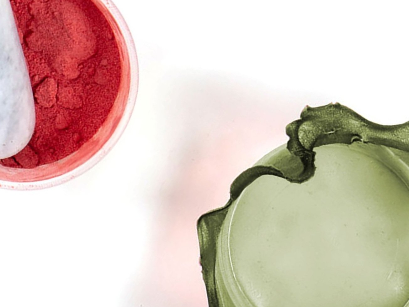
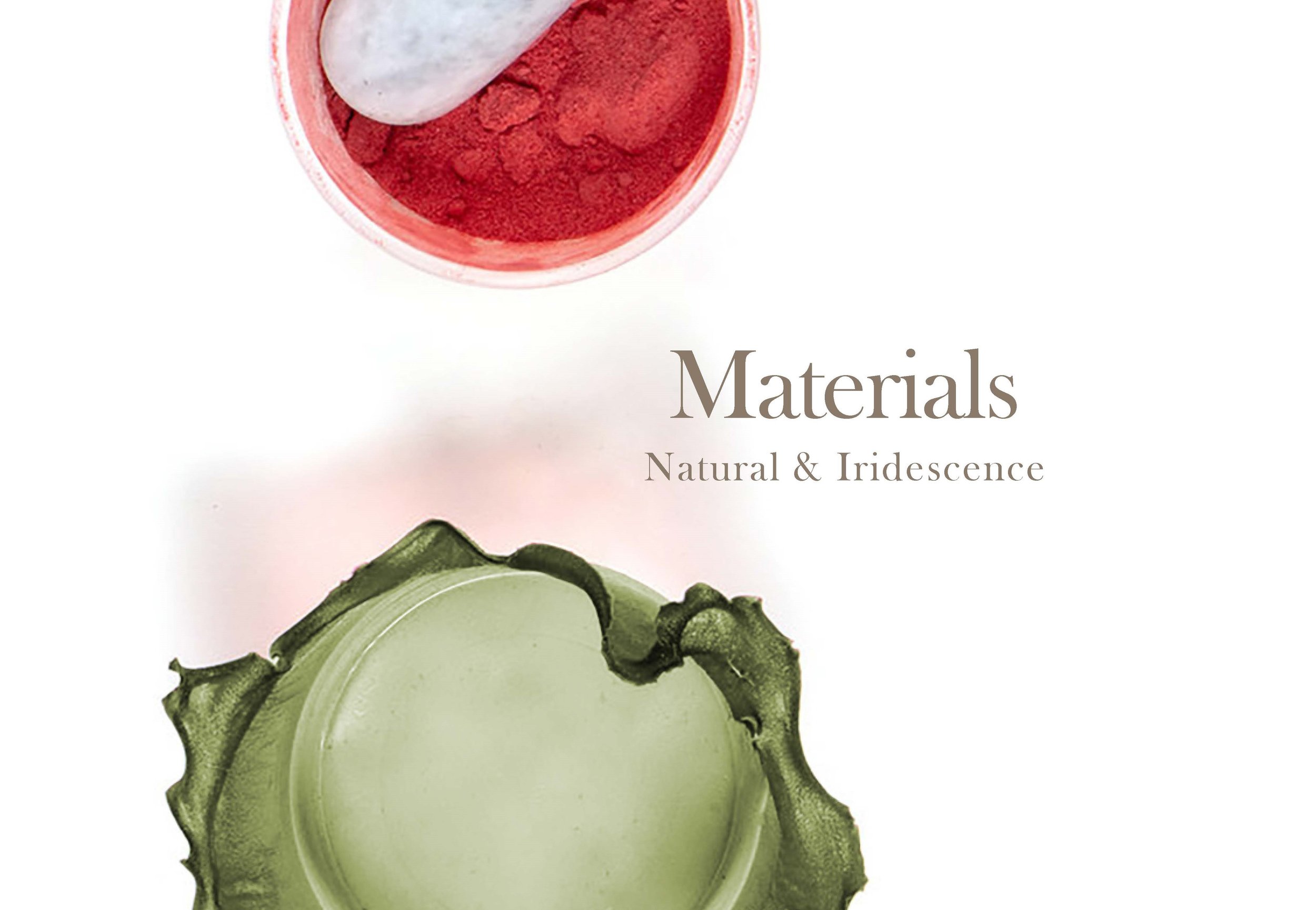
Materials
The sustainability theme is originating to protect ‘Mother Nature. Nature themes continue to influence world culture with craft and quality at the fore trend.

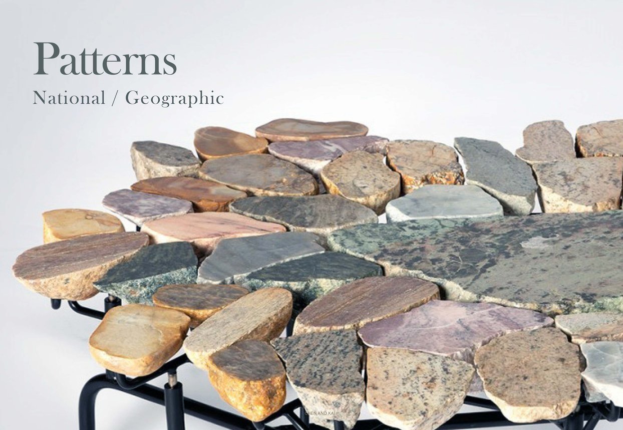
Patterns
It is an era of coexistence between nature and human. Human goes to nature. Nature approaches human. Naturally, generated material is unexpected, which is creative craft from nature.