EMBRACE 2030
Cadillac Sponsorship Project
EMBRACE presents an unexpected, warm space that ensures a new experience to customers who seek privacy above all else. EMBRACE offers a unique journey of comfort and safety for the Cadillac customer. It’s not just a luxury we can see; it’s a luxury we can feel.
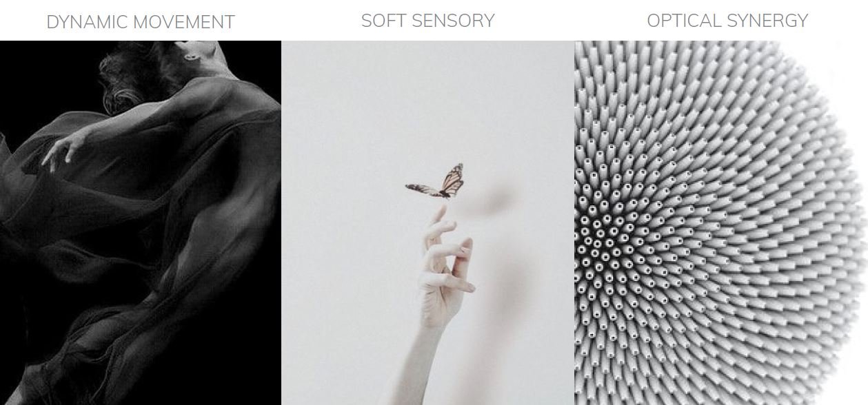
TREND: EXPOSE vs. OPEN
In 2030, millennials will more be focused on trying to improve their quality of life. Technology must focus on the skills that are key to our humanity and not on those that make us more like machines. However, many surveillances are placed around us, which results in a certain lack of trust. Living in a surveillance society tells us that we are not to be trusted and that others are not to be trusted either. The vision for the future is that all working will be flexible.

FUTURE CADILLAC LANDSCAPE
Cadillac EMBRACE provokes an emotional response through sensory features within the interior of the vehicle. shapes, textures, and colors of the interior design create a luxurious premium space. You are guaranteed comfort and warmth while on this journey.


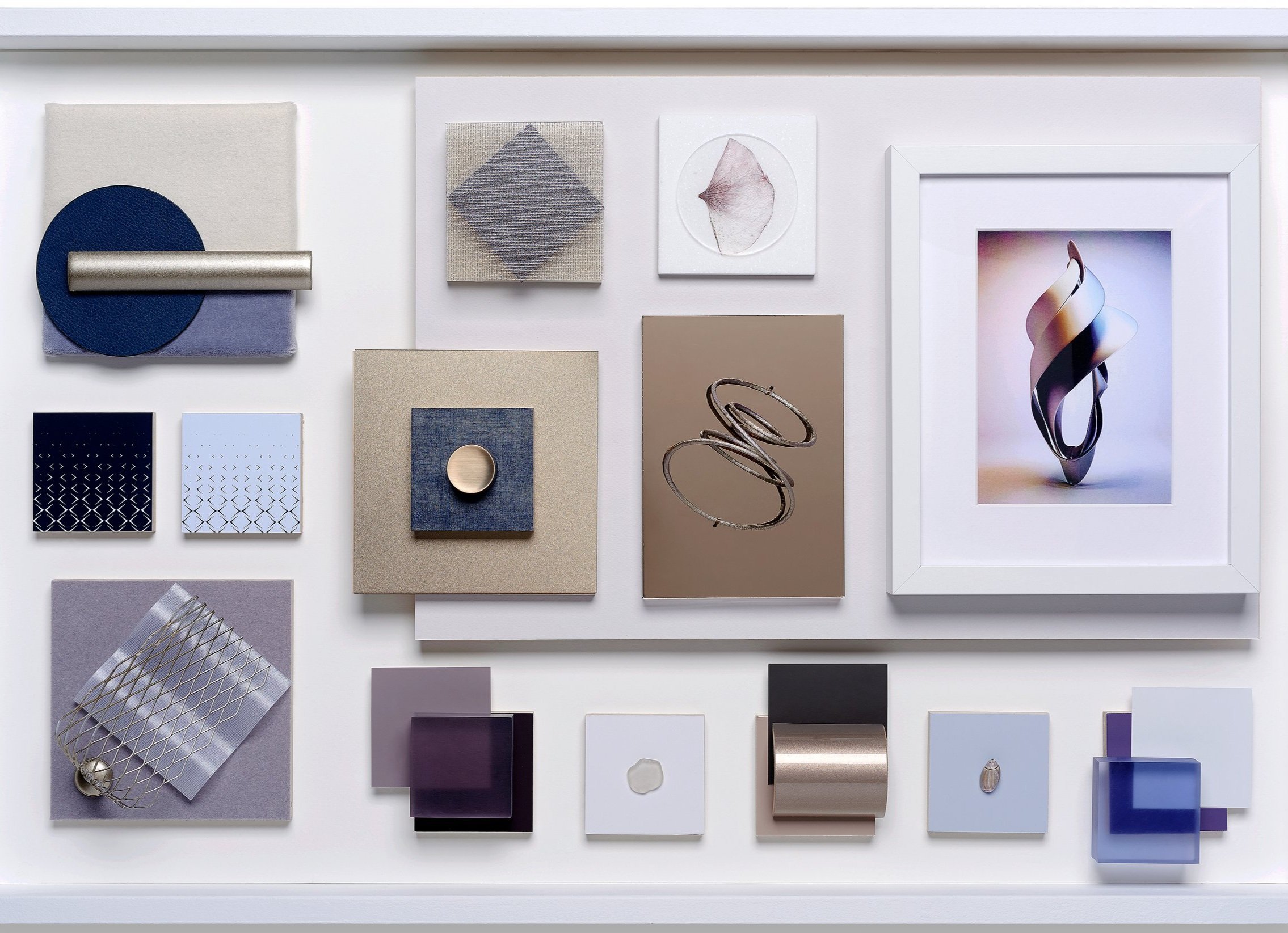
CMF Concept Inspiration
In the hyper-connected 2030, consumers are tired of intensely close monitoring that has resulted in an infringement of their privacy. Consequently, a private space - a refuge - is an extraordinary experience. EMBRACE concept creates this refuge using soft materials, organic structures, and layered effects to creates a sense of safety and warmth. The color palettes use bluish, ultra-violet tones layered over warm metallic finishes to create a sense of harmonious movement. Texture and pattern inspired by wing-like shapes echo the soft, enveloping feeling of the inside of a nest.
Surfaces and the way they are illuminated is an important element in the Embrace interior concept. The harmony between the bluish, ultra-violet tones layered over the luster of the warm metallic finish makes for a perfect combination. The colors of the interior are a trio of dark navy display glass, burnished bronze finishes, and textured lighter Berkshire beige leather that contrasts through their softness mink hair on hiding with velvet.
Color scheme


Color Analysis & Proportions
The palette evokes a calming yet powerful emotion. The comforting sense of this palette balances a soft mid-tone are core point, with entrancing dark navy and matte copper gold creating a dramatic contrast. The coexistence between the warm color and cold color is well-balanced to enhance the comfort feeling. In here, analyzes the relationships between individual colors to explore the proportions among colors this palette.

The violet base of blue is extremely calm as a warm mood with mat Gold. Also, the bright cream tone touch effect provides comfort and warm emotion. Using lusterless Gold as the accent color and bluish violet as a core provides a premium space of this positivity (01). The bluish violet color in this combination glows against a backdrop of dark tone navy color. A combination with the cold appeal is a luxury feel in this proportion with the softened accent adding warmth with Gold color (02). Use the dark navy color as an accent color, lusterless Gold color in smaller proportions with the dull mid-tone violet brings calm to the palette. The dark navy acts as a bridge with cool colors and brings elegance to the group (03). The potential effect of a trio sharing an underlying natural tone is embodied by the degree of contrast between each color. The unifying tone ensures the luxury sense through the entire color palette via the accent color, which is mat gold (04). The two lightest and darkest shades of the palette line up an attractive display of contrasts. The balance between the lusterless Gold mirrors the absolute polarity of the light cream color and dark navy (05). Light cream and bluish violet are equally saturated with similar hues, creating a cool monochrome, a real tonal duo. The interplay of the dark navy tone with each of Light cream and bluish violet colors creates an entirely singular duo to enhance an aesthetic of simplicity (06).
The layered effect provides essential rhythm and solidity for creating more tactile offerings for solid surfaces with wood, marbled finishes composites. Interior decoration combines soft materials with a metal structure with an LED display glass finish.
Hard Materials


Soft materials contribute real depth to enhance the intensity of the material palette. A natural and organic structure called waves is implemented on textiles, providing a tactility and warmth to the interior design.


